Article Text

Statistics from Altmetric.com
Introduction
Improving healthcare through evidence-based practice and policy hinges on decision-making informed by summarised research findings. Deciphering the salience of findings is not straightforward particularly when there are many competing interventions whose effects are evaluated on several outcomes ranging from critical to unimportant and when the strength of the evidence may vary for each. For generating recommendations, the quality of the evidence is assessed to determine the extent to which the estimates of observed effects are likely to be correct for clinically important outcomes.
Evidence quality assessments increasingly employ Grading of Recommendations Assessment, Development and Evaluation (GRADE),1 an approach that takes into account several domains including the importance of outcomes, study design, risk of bias, heterogeneity and imprecision of results (this is not an exhaustive list). This information is presented in tabulated form, which in some guidelines can be spread over hundreds of pages.2 There is a need to present quality data in a more effective way as the risk of it being misunderstood or not used at all is well recognised.3 Graphic display may make interpretation easier as presenting data visually is known to amplify cognition by capitalising on human perceptual capabilities.4 Graphic display, with several quality domains to capture, is not easy to design. We developed a graphic approach after several iterations, applying it to a field of medicine where there are several therapies and numerous outcomes. To demonstrate this approach, we performed a systematic review, assessed the findings using GRADE and summarised them using the proposed graphic display.
An example of evidence grading with several comparisons and outcomes
Evidence summaries on tocolysis for preterm labour is a good example for delineating the difficulty in interpreting large amounts of results as tables spread across many pages. In addition, this is a clinically important problem as perinatal complications due to prematurity influence the affected persons for the rest of their life, with a strong impact on the cost to economy.5 6 Delaying all preterm birth by just 1 week could potentially save £260 million/year in the UK.5
The various tocolytic agents or myometrial relaxants available are effective in delaying birth, and the decision as to which ones to use in practice is not straightforward.7 In part, the decision-making process is complicated by a wide range of outcomes measured in published studies and lack of consensus about their importance. The strength of the evidence should be evaluated separately for each outcome as the strength can vary considerably across outcomes, even when the evidence comes from the same studies.
We conducted a systematic review of literature up to 10 December 2010, which identified 1185 potentially relevant citations among which we included 60 randomised trials of tocolytic therapies in women with singleton pregnancies experiencing threatened preterm labour. This updated previous reviews on the subject.8,–,10 We extracted data on the effects of atosiban (8 studies), β agonists (13 studies), calcium channel blockers (15 studies), indomethacin (8 studies), nitric oxide donors (6 studies) and magnesium sulphate (10 studies) on the outcomes reported. The evidence was assessed according to the methodology described in GRADE11 and tabulated using GRADEpro 3.2.
GRADE tables
We tabulated findings separately for tocolytic agents compared with placebo and those compared with β agonists. For each comparison and outcome pair, evidence quality was assessed on the following domains: study design, risk of bias, inconsistency, indirectness and imprecision. Whenever there was a deficiency (listed below), the quality was downgraded by one level (if the deficiency was classified as serious) or by two levels (if the deficiency was classified as very serious). These judgements were, by their nature, subjective, and we transparently reported the reason for downgrading quality in the tables of evidence (appendix 1).
■ Study design was assigned a ‘high’ level of quality as all evidence in this review was based on randomised controlled trials.
■ Risk of bias may arise from limitations in the study design and implementation. We downgraded evidence quality if there was lack of allocation concealment (selection bias), lack of blinding (performance bias), incomplete accounting of patients and outcome events (attrition bias) and other limitations affecting outcome assessment (detection bias). The level to which the quality was downgraded was related to the numbers of methodological items on which there were deficiencies.
■ Inconsistency, referred to as heterogeneity in results, could arise from differences in populations, interventions or outcomes. Widely differing estimations of the effects across studies suggest that there might be true differences in underlying effect. When group differences in the criteria for inclusion and exclusion from the studies (multiple pregnancy, gestational age, ruptured membranes) appeared, we decreased the quality rating. Also using alternative tocolytic agents may cause heterogeneity. When heterogeneity existed, but investigators failed to identify a plausible explanation, the quality of evidence was downgraded by one or two levels, depending on the magnitude of the inconsistency in the results. Conflicting results were downgraded to the lowest level.
■ Indirectness referred to broader or more restricted assessment of the review question components including population, intervention, comparator and outcomes. For example, when studies included women with multiple pregnancies, and the statistical disaggregation from singletons was not possible, this led to limitation in the applicability of the findings. Tocolytic dosage significantly higher or lower than that approved, registered or recommended by an agency or official body may also lead to inapplicability of findings. Another source of indirectness was use of maintenance therapy such that the effectiveness of initial (loading) tocolysis could not be determined independently. Downgrading of quality related to the likelihood of reduction in generalisability arising from the items highlighted above.
■ Imprecision of results referred to wide 95% CIs due to few participants or few events. We downgraded the quality of evidence in proportion to the imprecision arising from a non-significant result or the width of CI that had a bearing on the observed point estimate of effect.
We tabulated these features and assigned an overall quality grade to evidence for each comparison-outcome pair. The footnotes in each table provide an explanation as to how we downgraded evidence in light of various deficiencies. Publication bias, a systematic underestimate or an overestimate of the underlying effect due to the selective publication of studies, was not assessed because of the small number of studies per comparison available to generate meaningful funnel plots.
The tables, including data on all outcomes, spread across 29 pages with a word count of 10 827 (available from authors on request). To determine the importance of outcomes, we undertook a formal survey of over 500 practitioners asking them to provide responses on a scale anchored between critical at one extreme and not at all important at the other. Such a survey, not essential for developing the plots described below, helped us to focus this study on the outcomes ranked clinically important by at least 50% of respondents. These data spread over 11 pages with a 4353 word count (appendix 1). There were many deficiencies in the quality of the evidence. For example, there was often poor allocation concealment and lack of blinding (of interventions and for outcomes assessment) especially in studies comparing two active agents. In many comparison-outcome pairs, there was heterogeneity or indirectness.
Construction of graphic display
Graphs were designed to meet key requirements for optimal graph comprehension.12 For each comparison-outcome pair, we deployed a two-dimensional chart plotting five variables represented on equiangular spokes starting from the same point, each spoke representing one of the domains used in evidence grading. These included study design, risk of bias, inconsistency, indirectness and imprecision. The data length of a spoke was proportional to the magnitude of the quality ranging from high to moderate to low to very low. A line connected the data values for each spoke generated a pentagon. Consistent use of the same position and angle of the spoke in all comparison-outcome pairs was used for easy visual interpretation in a multiplot format. The plots were constructed using Microsoft Excel.
GRADE plots
Figures 1 and 2 plot the comparisons against placebo and those against β agonists for outcomes considered critical and important. They provide a visually striking display of the strengths and weaknesses of the evidence across the spectrum of comparisons and outcomes which when tabulated (appendix 1) is dry and cumbersome to read and assimilate.
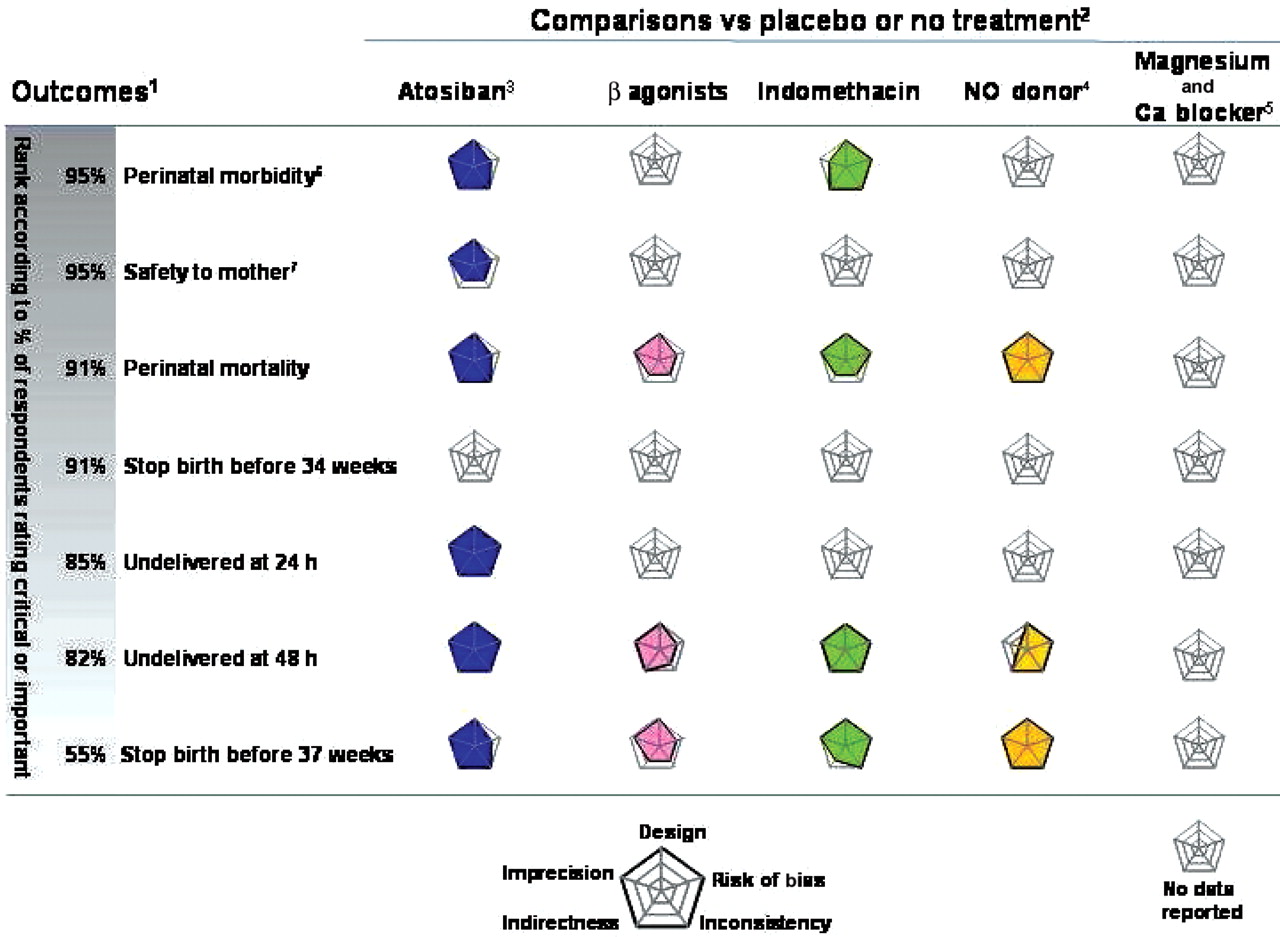
Graphic display of evidence quality on tocolytic efficacy compared with placebo or no treatment in randomised trials. Each graph represents the quality domains shown on concentric spokes. For each of the spoke, the length represents the magnitude of quality ranging from very low at the centre of the plot to high at its maximum length. Concentric lines rippling out of the centre show quality increasing to low and then to moderate before reaching the maximum value of high. Evidence quality tabulated in appendix 1 and tables A–D. 1Importance of outcome ranked according to percentage of respondents who considered it critical or important in a survey (see text for details). 2Presented in alphabetical order except Ca blocker which is presented along with magnesium sulphate. 3Atosiban trade name Tractocile (Ferring pharmaceuticals), which is now not protected by patent. 4NO, nitric oxide. 5Ca, calcium channel. 6Based on neonatal admission to intensive care unit. 7Based on maternal drug reaction requiring treatment cessation.

Graphic display of evidence quality on tocolytic efficacy compared with β agonists in randomised trials. Each graph represents the quality domains shown on concentric spokes. For each of the spoke, the length represents the magnitude of quality ranging from very low at the centre of the plot to high at its maximum length. Concentric lines rippling out of the centre show quality increasing to low and then to moderate before reaching the maximum value of high. Evidence quality tabulated in appendix 1 and tables E–I. 1Importance of outcome ranked according to percentage of respondents who considered it critical or important in a survey (see text for details). 2Presented in alphabetical order except magnesium sulphate to allow easy comparison with figure 1. 3Atosiban trade name Tractocile (Ferring pharmaceuticals), which is now not protected by patent. 4Ca, calcium channel. 5NO, nitric oxide. 6Based on neonatal admission to intensive care unit. 7Based on maternal drug reaction requiring treatment cessation.
One can either look at each plot individually or identify clusters of comparison-outcome pairs with similar features. For example, looking across tocolytic agents in figure 1, evidence is lacking for magnesium sulphate and calcium channel blockers for all outcomes and no information is available for all agents on the outcome birth before 34 weeks' gestation. Where evidence is available, it tends to be of good quality, lacking only in one or two domains. When looking at individual plots in figure 2, the strength of the evidence is high for atosiban for perinatal morbidity as there are no limitations in the methodological quality of the studies, the results are consistent across studies, the data refer directly to the outcome and the CI around the point estimate of effect is narrow. Note the contrast with indomethacin for the same outcome where the data have serious imprecision around the observed effect. Comparing figures 1 and 2, we can see that the available evidence of tocolytic effect against β agonists compared with that against placebo tends to be of poorer quality and lacking in several domains.
Strength of the graphic display
Sensible and judicious interpretation of the evidence is difficult when there are many comparisons and outcomes. A graphic display that can capture the quality of the evidence for many comparisons and outcomes simultaneously in one diagram makes it possible to comprehend large amounts of data in one glance. The legend, once understood, allows for appraisal of key issues concerning study design, risk of bias, heterogeneity, directness of evidence in relation to the question and precision of results. Critical appraisal underpins the trust we can place in the evidence summarised, and graphic display makes it easier to present this information for decision-making. To maintain transparency, the summary of findings tables should be available along with the graphic plots.
One concern about evaluation of evidence strength is that the assessment of the various domains has an inherent element of subjectivity. For example, the consistency of effects required across studies in order to be homogeneous is a matter of judgement. The same applies to the width of a CI when assessing precision. This is a generic criticism of any evidence grading system, and the graphs help to delineate these issues instantly. When inspection of the grade plot demonstrates an interesting observation, either clustering or outliers in quality, overall or in specific domains, the readers can revert to the tabulated details to direct their curiosity on the issues of interest. The judgements, made explicit in the footnotes of the tables, when understood, help make sense of the reasoning employed.
Another strength of our graphic approach is the flexibility it affords in displaying information. For example, if all the evidence is based on randomised trials, one could consider eliminating this spoke from the plot as this information does not assist in discrimination across comparisons and outcomes. In another situation where information on publication bias is available, an additional spoke for this domain could be added. The numbers of spokes (quality domains) that can be included in the plot to optimise interpretation should be a subject for future research.
Limitation of the graphic display
The plots we have deployed are not without limitations. They are primarily suited for capturing striking outliers and commonality. They are unlikely to be suited for making trade-offs, particularly when one plot shows higher quality than another on some domains but lower on others. For example, when examining figure 1 on outcome perinatal mortality, atosiban and indomethacin score high quality in all domains except risk of bias, where the former is deficient, and imprecision, where the latter is deficient. As each of these domains is likely to play a different role in overall quality, it would be difficult to determine which one of the two evidences is superior. The length for each spoke is ordinal, and the degree of difference across domains involves judgements made clear in the tables. It may be difficult to visually compare the quality of different domains as spoke distances may be hard to judge. Concentric circles used as grid lines help in this regard. Although the order of spokes is not materially important, joining them with lines might create spurious illusion of connections between neighbouring domains. It is also difficult to judge the area as a measure of quality, and this should be avoided for individual plots. This feature is, however, useful with several plots to compare simultaneously and should be a part of future research. There are alternatives to our approach; for example, instead of pentagonal plots, star plots13 may be used. Comparing different graphic approaches with decision makers to determine how they use the visual images to interpret the evidence and whether this affects their decisions should also be a topic for future research. Finally, the plots focus on domains of evidence quality that underpin overall quality assessment. Decisions require further information14 on directions and magnitudes of effects and balance between benefits, and costs and harms. How these data could best be incorporated with the plots is another subject for future research.
Conclusion
There is considerable scope for confusion when moving from evidence syntheses to recommendations. The graphic approach we have developed can make the job of evidence assimilation for decision-making easier. When guideline statements are accompanied by these plots, this also has the scope for improving the credibility of the recommendations made as the strength of the evidence used will be easily seen.
Appendix 1
Grading of Recommendations Assessment, Development and Evaluation tables on efficacy evidence for tocolytic therapy (excluding information on unimportant outcomes)
References
Supplementary materials
Web Only Data ebm0005
Files in this Data Supplement:
Footnotes
-
The EBM-CONNECT (Evidence-Based Medicine Collaboration: Network for systematic reviews and guideline development research and dissemination) Collaboration L Mignini, Centro Rosarino de Estudios Perinatales, Argentina; P von Dadelszen, L Magee and D Sawchuck, University of British Columbia, Canada; E Gao, Shanghai Institute of Planned Parenthood Research, China; BW Mol and K Oude Rengerink, Academic Medical Centre, The Netherlands; J Zamora, Ramon y Cajal, Spain; C Fox and J Daniels, University of Birmingham, UK; and KS Khan, S Thangaratinam and C Meads, Barts and the London School of Medicine, Queen Mary University of London, UK.
-
Funding The authors received funding from the European Union made available to the EBM-CONNECT Collaboration through its Seventh Framework Programme, Marie Curie Actions, International Staff Exchange Scheme (Proposal number: 101377; Grant Agreement number: 247613); EBM-CONNECT Canadian Collaborators received funding from the Canadian Institutes of Health Research; and from Ferring Pharmaceutical for undertaking the review. No funders played a role in the planning and execution of this work and in drafting of the manuscript.
-
Competing interests Uniform disclosure of potential conflicts of interest: all authors have completed the ICMJE unified competing interest form at http://www.icmje.org/coi_disclosure.pdf (available from the corresponding author) and declare (1) KSK and Arcana Institute received grants for part of this work from Ferring Pharmaceuticals; (2) KSK and BWM had travel expenses reimbursed and received honoraria for delivering educational presentations for various official bodies of Obstetrics and Gynecology and for having done consultancy for Ferring Pharmaceuticals. All authors also declare (3) no spouses, partners or children have relationships with commercial entities which might have an interest in the submitted work; (4) no non-financial interests may be relevant to the submitted work.